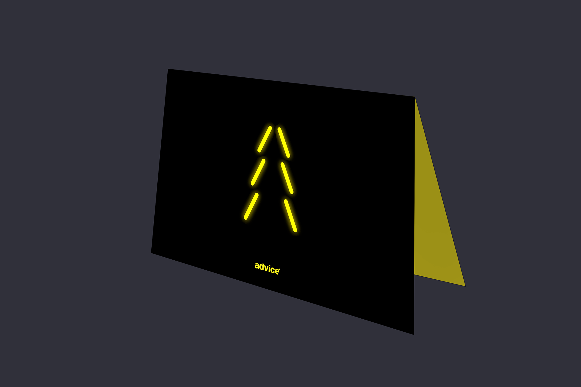
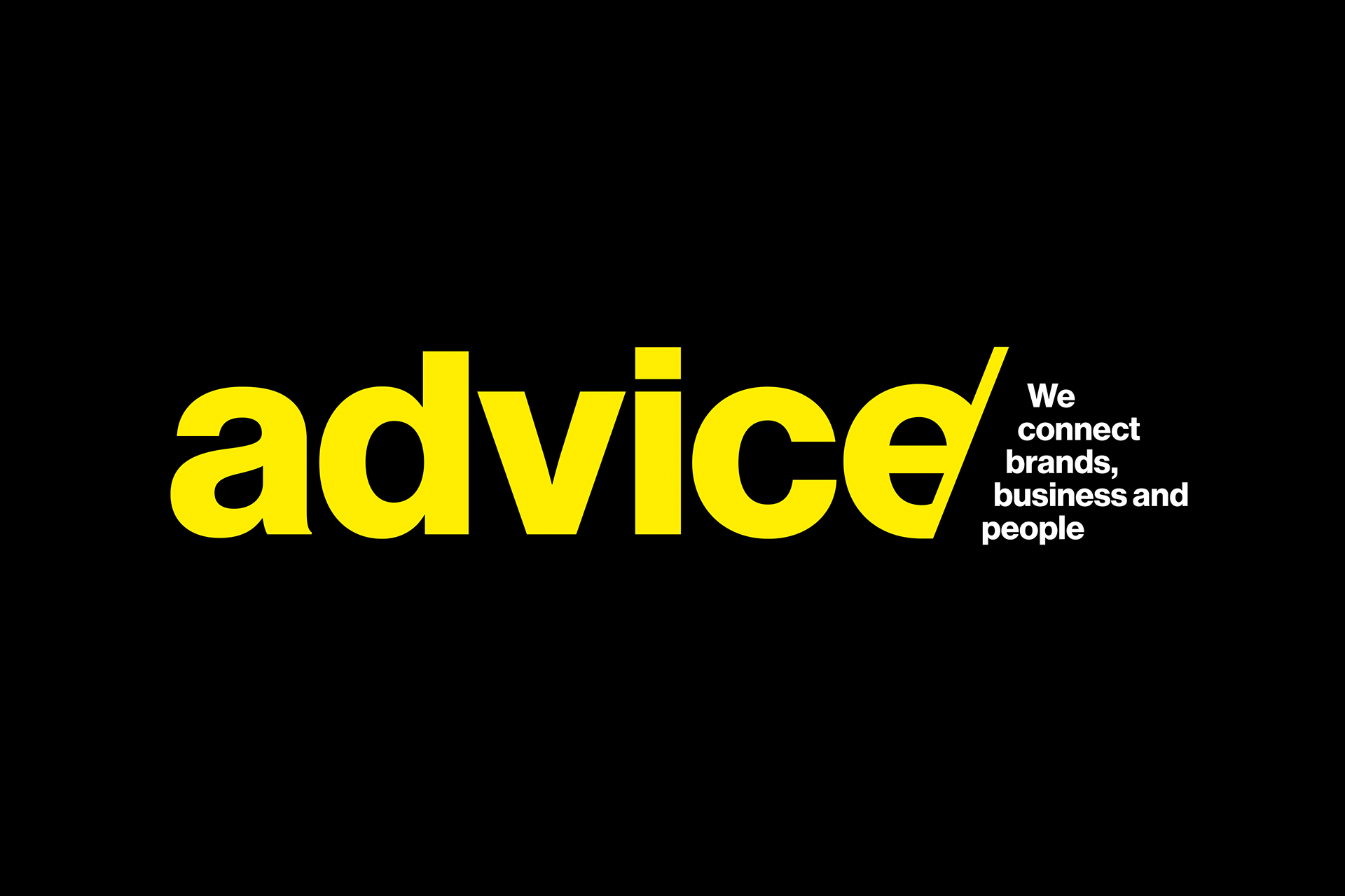
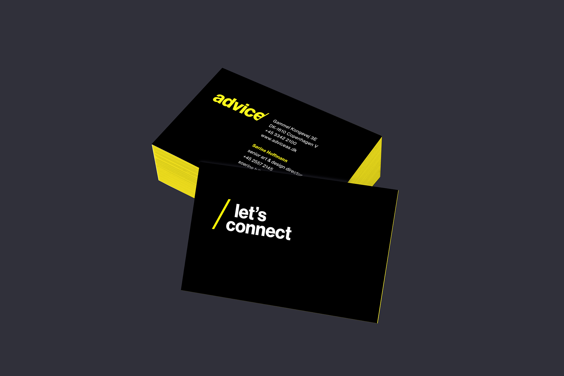
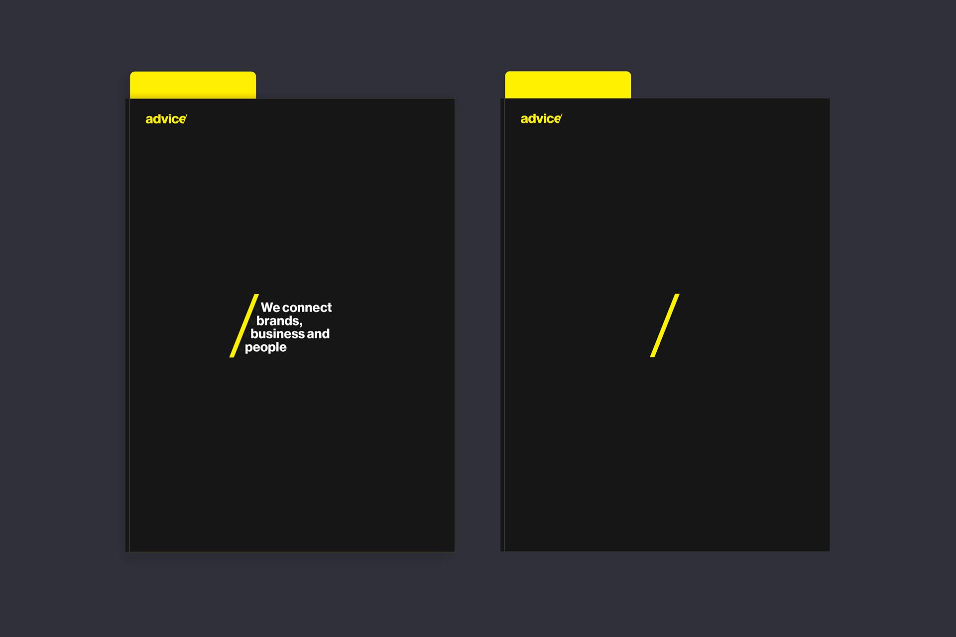
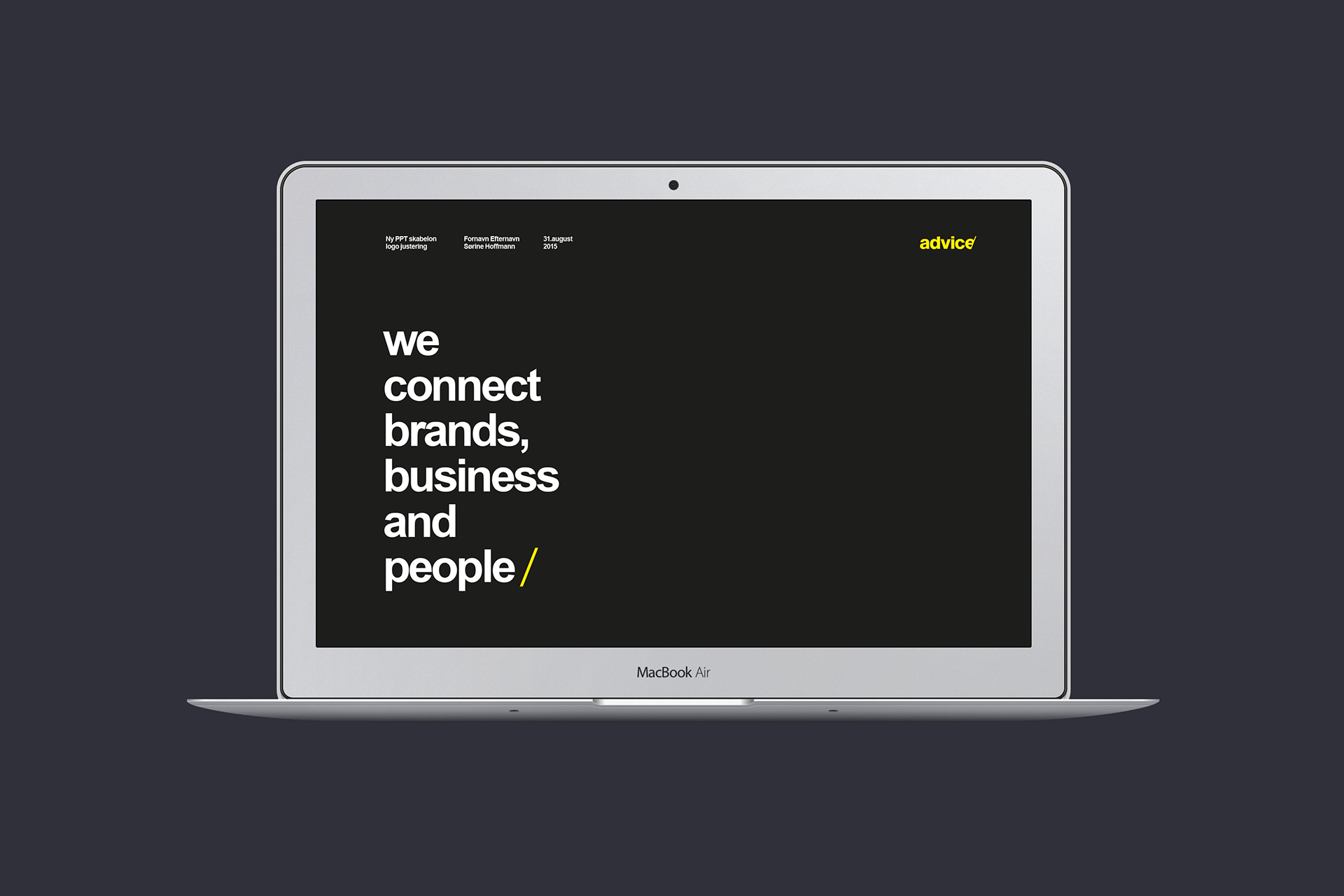
The merge between Advice and Advice Digital called for a revitalized brandplatform, identity and everything that could possibly belong to the process, of transforming the agency, from a communication consultancy to a creative agency. The identity is built on the perception of Advice as the serious but friendly agency, on the danish advertising market. The logotype is neutral by nature demonstrating inclusive and democratic values. The slash cutting into the logotype creates a spaceholdning, a promise of more to come, a possibility of combinations, relations, divisions e.g., on top of giving the bold, stern and strong colored identity, a usefull fifth element (the slash) to be animated, implemented and used as a storytelling device, to support the tagline, while creating a connection between the analouge world - where the functions of the slash has mulitple meanings according to how and when it is used, and the digital world - where the slash is used as a division operator in most programming langugaes and urls.

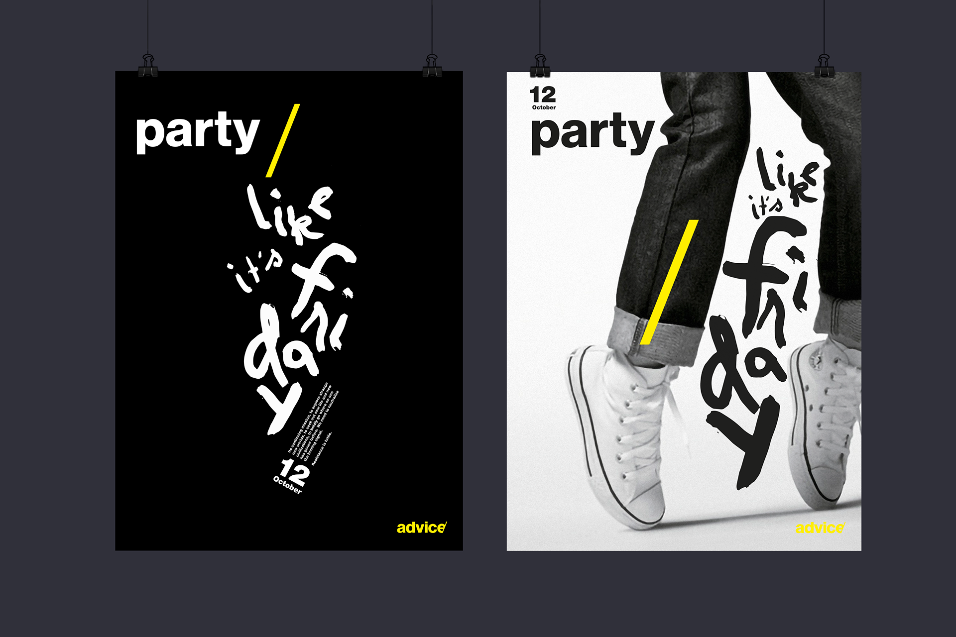
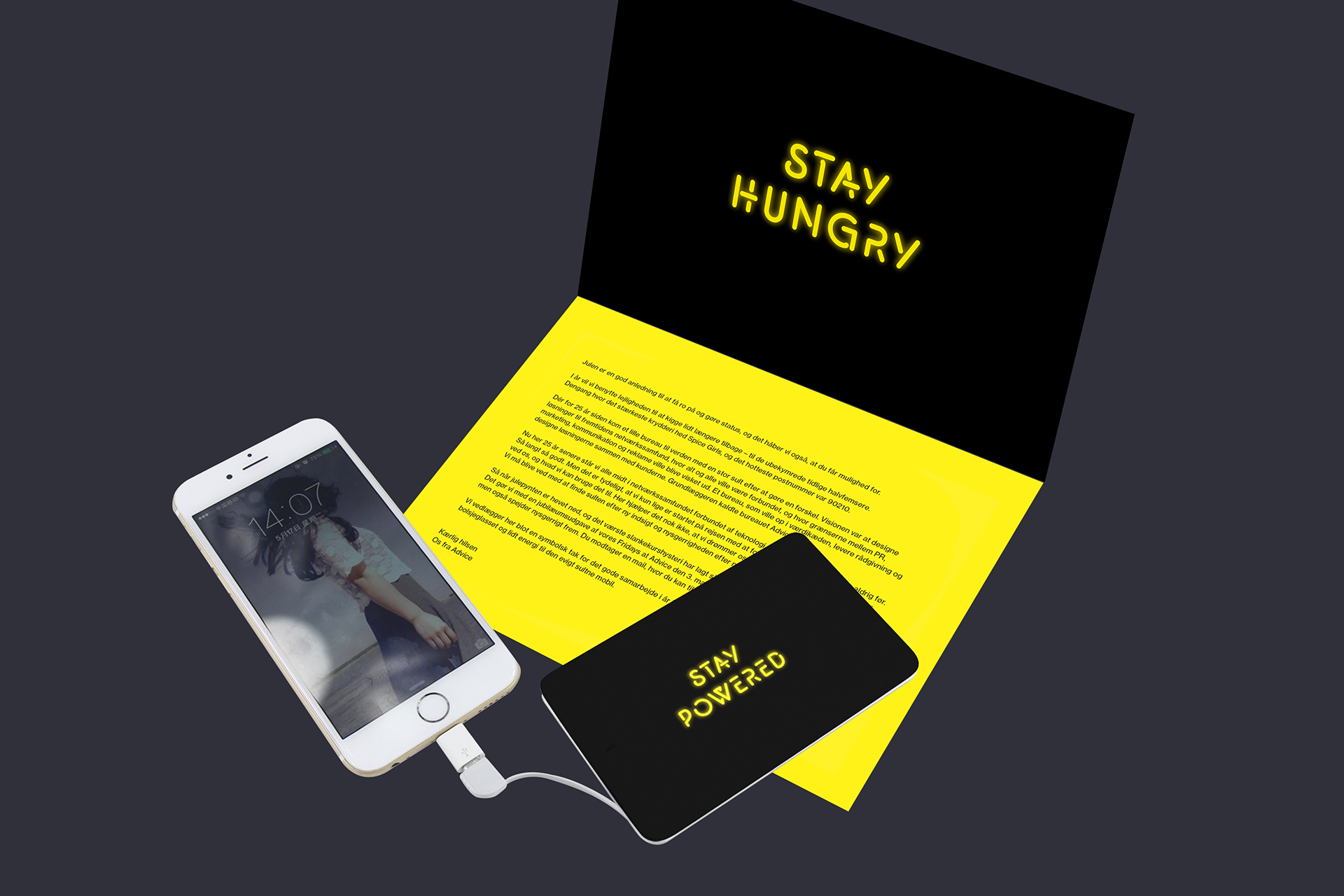
Advice christmas theme & party invitation 2016
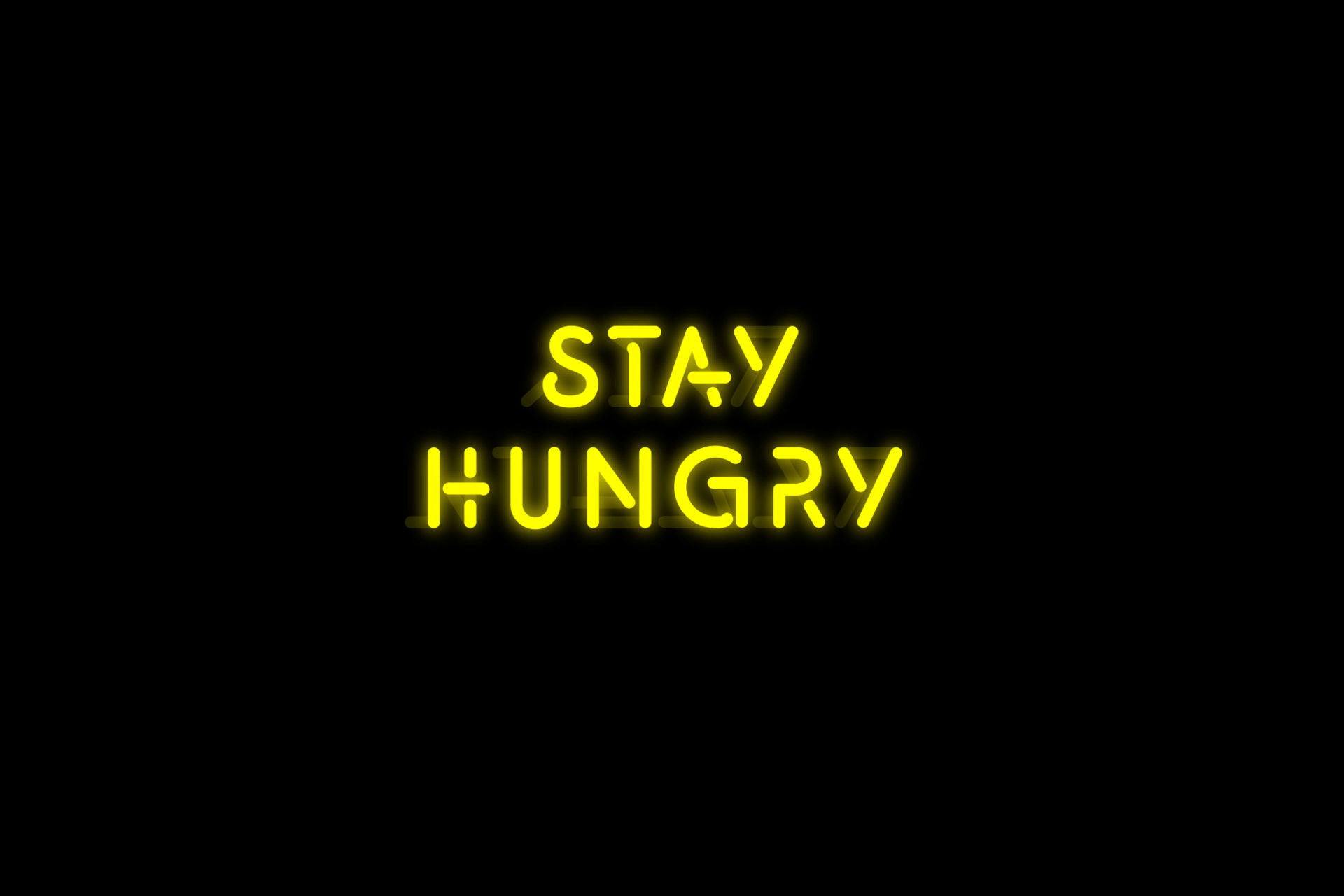
The christams party year 2016 doubled as Advice's 25 years anniversary. The theme is a referrence to 1991, back when neon signs were the "gif" of it's time, and the message - a homage to the Steve Jobs qoute "Stay hungry, stay foolish" - that served as a continued inspiration for a way of working with innovation and creativity.